Couldn't load pickup availability
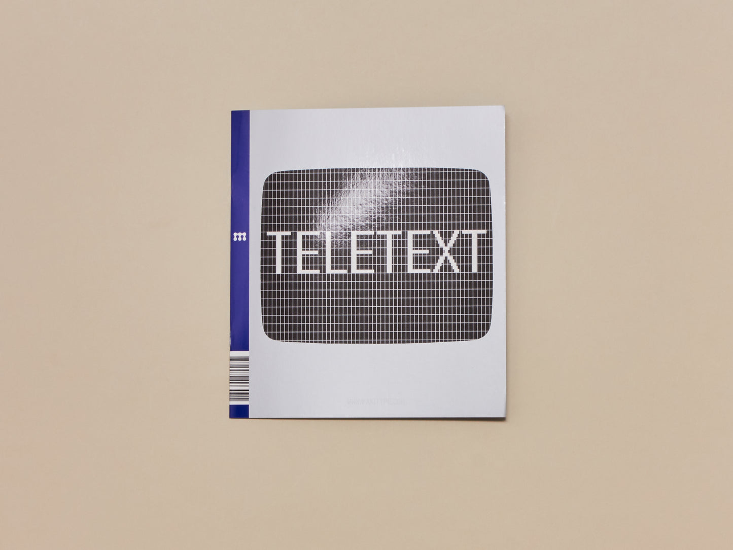
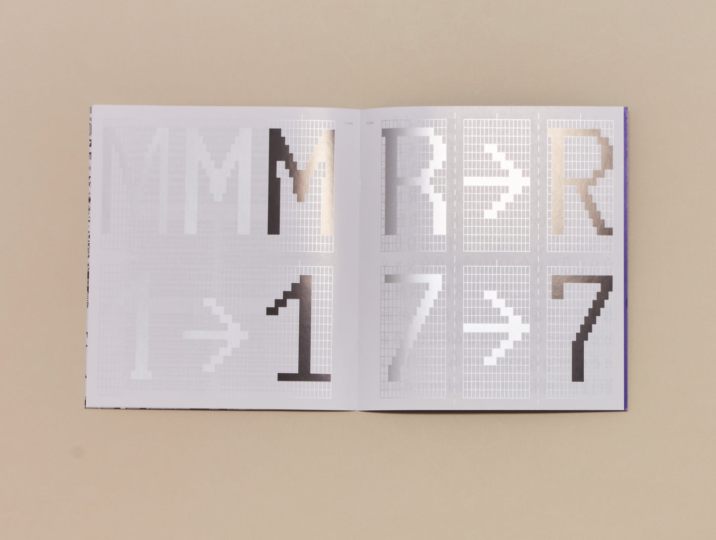
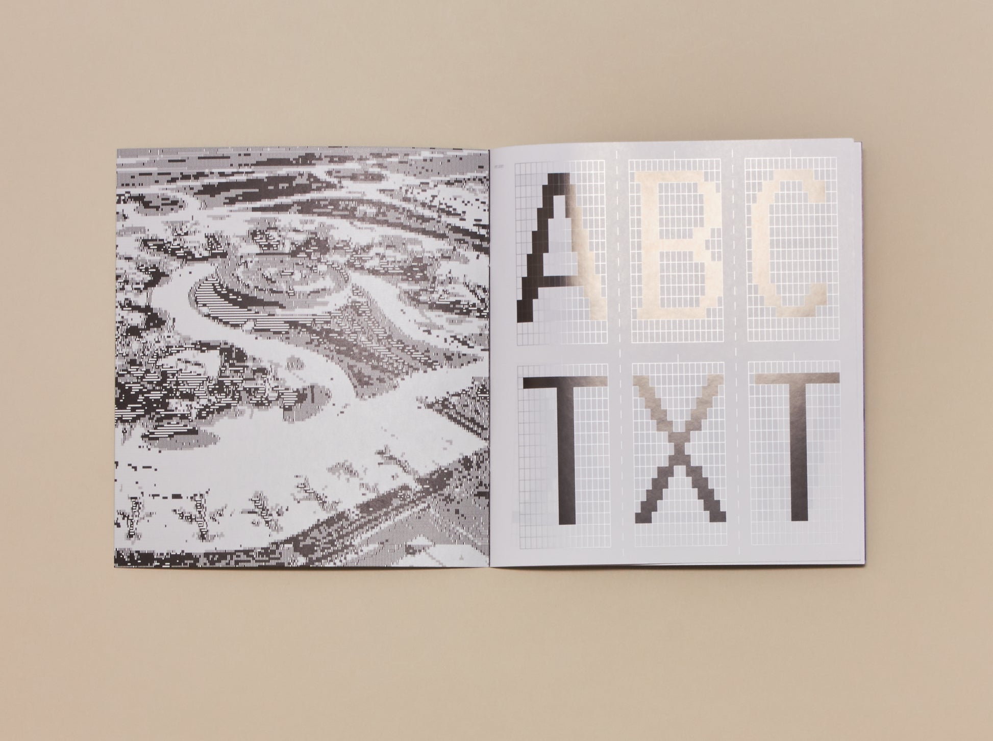
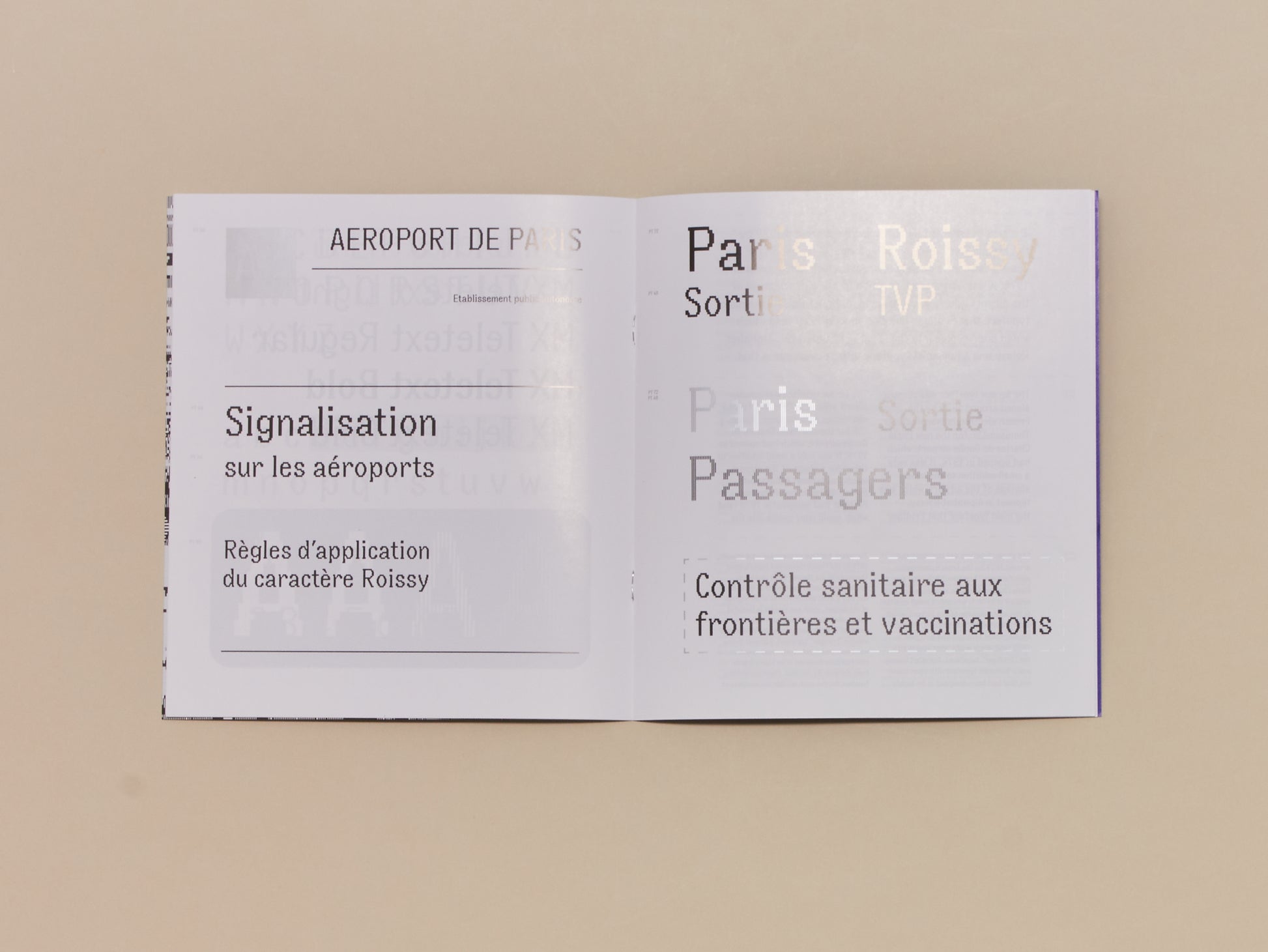
While consulting the extensive Frutiger archive at the Museum für Gestaltung’s Graphics Collection in Zürich, Maximage’s interest was piqued by a mysterious bundle named [Caractères TVP / Teletext]. The folder contained a large quantity of sheets featuring pixel letters drawn by hand onto a 16×16 xeroxed grid. Its matrices had an unusual ratio of 1:2 which created narrow vertical proportions. The folder also contained various optical correction tests, alternative glyphs and even attempts to simulate the effect of screen glow on the typeface. Every single piece of paper punctiliously bore the refrain of Frutiger’s initials — AF — which gave it the air of a quality-control stamp by the master.
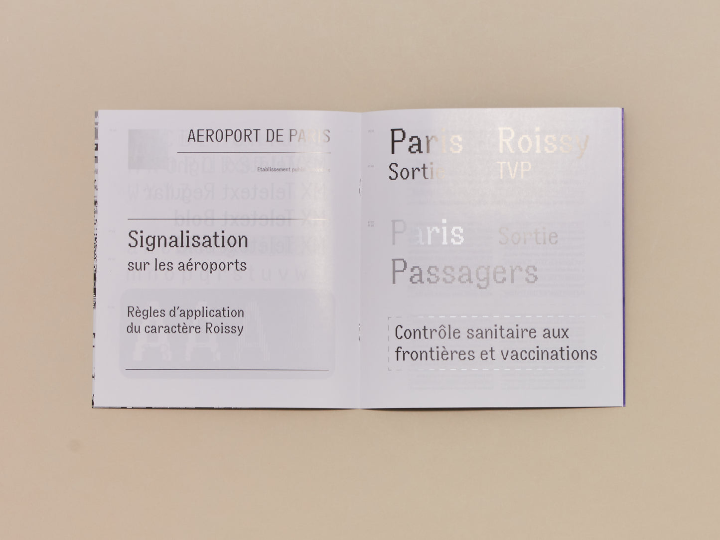
The screen typeface was commissioned around 1979 by the French electronics manufacturer Thomson-CSF for the new Paris Charles de Gaulle airport, which had opened in 1974. It was only a small addition to the wider signage of the airport, which was typeset in Alphabet Roissy, the main typeface that Frutiger had designed in 1970 (and which would later evolve into the “Frutiger” typeface). Alphabet Roissy was a humanist typeface with open counters that had been designed to be highly legible from distance. By contrast, Thomson needed a typeface for the much smaller CRT monitors of the internal TV system which displayed departure and arrival times Frutiger answered the design problem with his sophisticated pixelated Caractères TVP, whose shapes retain warmth and a humanist quality thanks to their light traps.
For Maximage, this anachronistically low-resolution typeface represents some of Frutiger’s most impressive work. The technical limitation of the CRT screen grid mismatched Frutiger’s humanist approach. Far from being cornered by the technology, Frutiger created an elegant hybrid —a humanist pixel font — whose details are fascinating. At a distance, the letters’ open counters create a highly legible type colour. Getting closer, Frutiger’s precise drawing becomes apparent. Strokes sometimes end with a little slab or a pixelated teardrop shape to avoid screen bleed. Additionally, characters with acute angles feature noticeable light traps which make the text look unexpectedly sharp in small sizes and extremely graphic in bigger sizes. Frutiger successfully addressed a technological challenge with his masterpiece, which was only in use for a few years – a new generation of screens would soon have sufficient resolution to support Alphabet Roissy.
