Couldn't load pickup availability
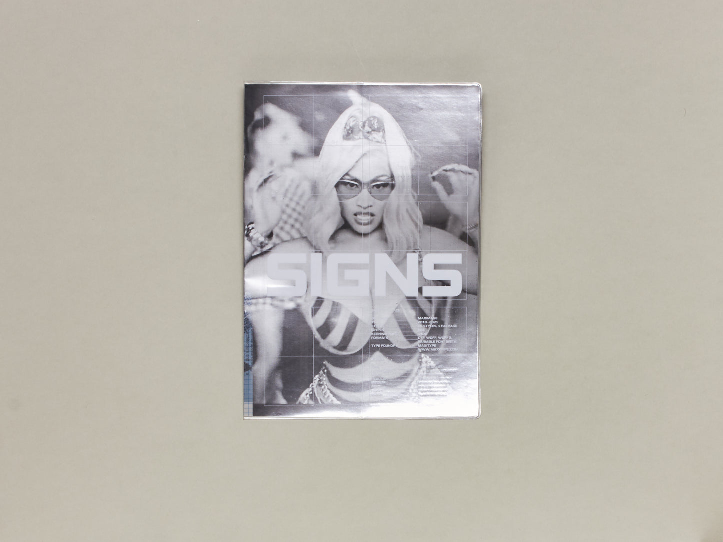
Signs
Respect the Architect
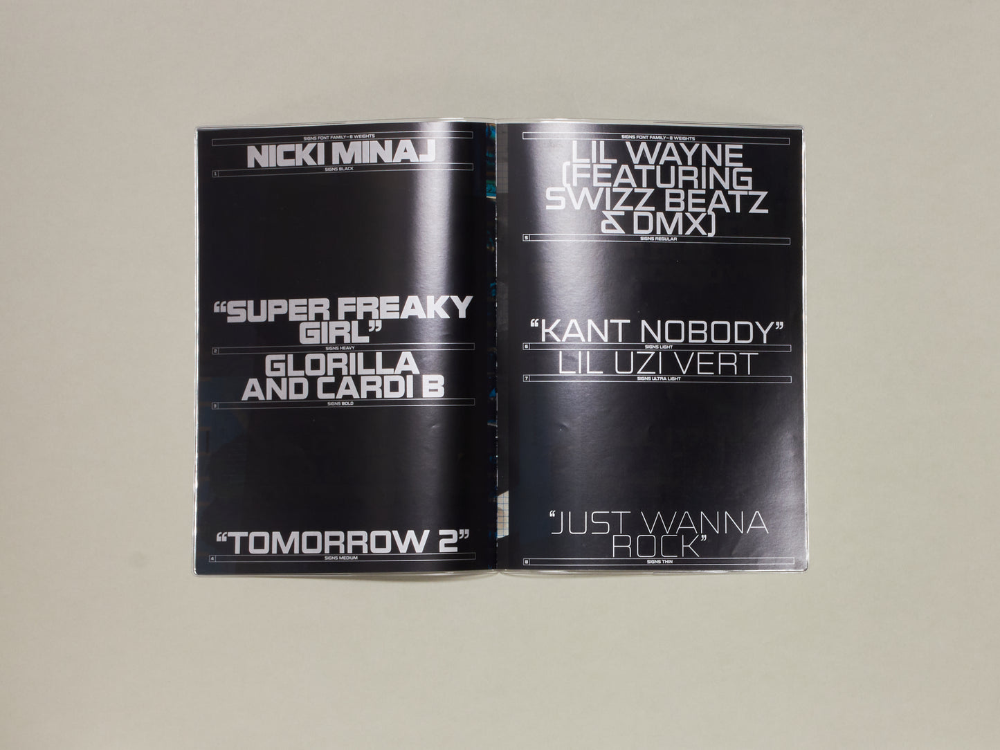
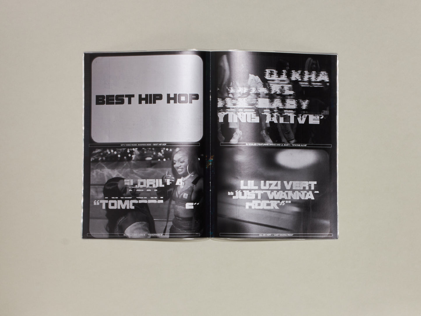
Signs is a new modern and multipurpose typeface designed by Maximage between 2018 and 2021. It was inspired principally by mid-20th-century typefaces designed for signage and used in the architecture industry. Composed of 8 weights ranging from thin to black, it offers a fully functional family combining simplicity and visual impact. Signs is a legible typeface designed to be simultaneously eye-catching from afar and to look exceedingly sharp up close.
Prölss’s publication Schriften für Architekten (1957) [1] inspired a study of this typeface genre. It led to an exploration of the relation between form and counter-form which is at the core of the design. Angular counters respond to the letter’s external curves and do so differently for each weight. The forms and counter-forms of the Thin and Black versions are perfectly inverted. The Light and Ultra Light weights offer razor-sharp positive and negative forms. The width of the Medium and Regular weights is adapted, and both offer rounder counter-shapes that recall some aspects of Aldo Novarese’s Microgramma. This makes them just as suitable for text use and captions at smaller sizes. The Bold cut is a detailed exploration of the balance between square counters and organic curves. Finally, the Black is spaced and kerned tightly to create a masterful rhythmic interaction between glyph spacing and counter-shapes, which makes it perfect for typesetting in blocks to the strongest impact.